
Collegiate Track and Field Data, Summarized
Statistical Updates - Collegiate Track and Field
By Colin FitzGerald
Author’s Note: This page will be updated weekly as new data becomes available.
Page last updated: 5/16/2021 at 10:09 P.M.
As I watched the times go up on the board, I couldn’t believe my eyes.
“That many guys broke 3:40?!”
I couldn’t believe it. Then again, maybe I could.
With the release of Nike’s new Dragonfly and Air Zoom Victory spikes, the running world has experienced a new depth of speed across the board. The shockingness of the results of each meet parallel those of 2017, when Nike first released the Vaporfly.
When new shoe technology is released, people are quick to question the credibility of performance.
Are we experiencing advancements in diet, coaching, and training that account for the sheer depth and difference in times? Is there a new miracle drug? How can we explain this insanity?
Those are all questions I, among others, ask myself as a fan of track and field.
This year’s depth across distance events from 800 meters to 10,000 has been remarkable. Times that used to be considered “other-worldly” are now commonly run in a prelim heat.
Go back to the 2016 Olympic Trials.
The very best runners lined up and went toe to toe in the final of the men’s 1500m. The result? A commanding win by Matthew Centrowitz. The time? 3:34.09, with a 53.95 final lap.
By comparison, Yared Nuguse just soloed a 3:34.68 in the prelims of the Men’s 1500m at ACC’s.
That got me thinking, is there any way that I can prove that the results of this year are statistically different than those of the past?
I went to work and created the project below, which shows the different statistics from 800m to 10,000m, starting in 2012 and ending with this year.
The project and this page will be updated over time as I continue to do work and develop more overall functionality of the project. Here is what I have so far:
The Project
The TFRRS website has an archive page that contains the NCAA Track and Field Outdoor Final Qualifying lists for every year since 2012.
The following functions reproduce those tables from the TFRRS website into pandas dataframes that can be directly manipulated for the purpose of data visualization.
I decided to do the data collection process this way so that I do not have to download each dataset to my computer, but rather I can pull it for each year directly to python.
I spent time studying the TFRRS website in order to properly configure my web scraper. The following functions are a cleaned and robust version of several python jupyter notebooks.
The first function below generates the URL on the TFRRS website. You input a year as a string, and the function will search the TFRRS archive HTML for the correct link to the outdoor performance list for that year.
def url_generator(year):
    base_url = "https://www.tfrrs.org/archives.html"
    req = Request(base_url, headers = {'User-Agent': 'Mozilla/5.0'})
    webpage = urlopen(req).read()
    page_soup = soup(webpage, "html.parser")
    url_search = page_soup.find_all("a", text=re.compile(year + " " + "Outdoor"))
    refined_url = url_search[0]["href"].strip("//").partition(")")
    return "http://" + refined_url[0] + refined_url[1]
The event_dictionary maps the TFRRS website HTML “div” classes to their respective disciplines. The event_code_generator is the function that, as you will see later in the code, implements that dictionary. Having the event dictionary allows our table generator to be more robust and abstract.
event_dictionary = {"100m": "row Men 6",
                    "200m": "row Men 7",
                    "400m": "row Men 11",
                    "800m": "row Men 12",
                    "1500m": "row Men 13",
                    "5000m": "row Men 21",
                    "10,000m": "row Men 22"}

def event_code_generator(str):
    return event_dictionary[str]
The table generator function generates a table from the URL created from the input year. However, the table is a bunch of gobbldy-gook html, so we need a couple more functions to recover the original table. I also created a separate one for the year 2021, because that data is still updating as the season completes. This way, as meets are completed and new data is uploaded to TFRRS, my functions will automatically update.
def table_generator(url, event):
    url_to_search = url
    div_class = event_code_generator(event)
    req_generator = Request(url_to_search, headers = {'User-Agent': 'Mozilla/5.0'})
    webpage_generator = urlopen(req_generator).read()
    page_soup_generator = soup(webpage_generator, "html.parser")
    html_class = page_soup_generator.find_all("div", class_ = div_class)
    for i in html_class:
        table_html_format = i.find("table")
    return table_html_format
The twenty_twenty_one table generator was built specifically for this year, because that information is contained on a different base URL, and is currently updating on a weekly or daily basis.
def twenty_twenty_one_table_generator(event):
    url_to_search = "https://www.tfrrs.org/lists/3191/2021_NCAA_Division_I_Outdoor_Qualifying/2021/o?gender=m"
    div_class = event_code_generator(event)
    req_generator = Request(url_to_search, headers = {'User-Agent': 'Mozilla/5.0'})
    webpage_generator = urlopen(req_generator).read()
    page_soup_generator = soup(webpage_generator, "html.parser")
    html_class = page_soup_generator.find_all("div", class_ = div_class)
    for i in html_class:
        table_html_format = i.find("table")
    return table_html_format
The split minutes and seconds function turns the time string into a float. For example, a time such as “3:39.7” would be converted to 219.7. The reason for this is that it makes the data visualization process easier. The function by itself does not make much sense because it is used in conjunction with the table formatter function.
def split_minutes_and_seconds(time_str):
        """Get Seconds from time."""
        split_list = (time_str.split(":"))
        return int(split_list[0])*60 + float(split_list[1])
The table formatter creates the tables themselves.
def table_formatter(table):
    headings = ["Rank", "Name", "Year", "School", "Time", "Meet", "Year"]
    # the head will form our column names
    body = table.find_all("tr")
    # Head values (Column names) are the first items of the body list
    body_rows = body[1:] # All other items becomes the rest of the rows
    all_rows = [] # will be a list for list for all rows
    for row_num in range(len(body_rows)): # A row at a time
        row = [] # this will old entries for one row
        for row_item in body_rows[row_num].find_all("td"): #loop through all row entries
            # row_item.text removes the tags from the entries
            # the following regex is to remove \xa0 and \n and comma from row_item.text
            # xa0 encodes the flag, \n is the newline and comma separates thousands in numbers
            aa = re.sub("(\xa0)|(\n)|,","",row_item.text)
            aa_stripped = aa.strip()
            #append aa to row - note one row entry is being appended
            row.append(aa_stripped)
        # append one row to all_rows
        all_rows.append(row)
        new_df = pd.DataFrame(data=all_rows,columns=headings)
        new_df["Time"] = [i[:7] for i in new_df["Time"]]
        new_df["Time"] = [split_minutes_and_seconds(i) for i in new_df["Time"]]
    return new_df
The TFRRS table generator function combines all of the above functions to properly create the table for a specific year and event.
def tfrrs_table_generator(year, event):
    if year == "2021":
        table_created = twenty_twenty_one_table_generator(event)
        table_formatted = table_formatter(table_created)
    else:
        url = url_generator(year)
        table_created = table_generator(url, event)
        table_formatted = table_formatter(table_created)
    return table_formatted

tfrrs_table_generator("2012", "1500m")
Heres an example:
| Rank | Name | Year | School | Time | Meet | Year | |
|---|---|---|---|---|---|---|---|
| 0 | 1 | Lalang Lawi | Arizona | 216.77 | Payton Jordan Cardinal Invitational | Apr 29 2012 | |
| 1 | 2 | O'Hare Chris | JR-3 | Tulsa | 217.95 | Payton Jordan Cardinal Invitational | Apr 29 2012 |
| 2 | 3 | van Ingen Erik | SR-4 | Binghamton | 218.06 | Virginia Challenge | May 12 2012 |
| 3 | 4 | Leslie Cory | SR-4 | Ohio State | 219.00 | Payton Jordan Cardinal Invitational | Apr 29 2012 |
| 4 | 5 | Hammond Michael | SR-4 | Virginia Tech | 219.22 | Payton Jordan Cardinal Invitational | Apr 29 2012 |
| ... | ... | ... | ... | ... | ... | ... | ... |
| 95 | 96 | Shawel Johnathan | SR-4 | Notre Dame | 225.65 | GVSU 2nd to Last Chance Meet | May 11 2012 |
| 96 | 97 | Goose Mitch | SR-4 | Iona | 225.70 | Princeton Larry Ellis Invitational | Apr 20 2012 |
| 97 | 98 | Vaziri Shyan | FR-1 | UC Santa Barbara | 225.71 | Big West Track & Field Championships | May 11 2012 |
| 98 | 99 | Kalinowski Grzegorz | SO-2 | Eastern Michigan | 225.73 | 54th Annual Mt. SAC Relays | Apr 19 2012 |
| 99 | 100 | Dowd Kevin | Virginia Tech | 225.79 | Wolfpack Last Chance (College) | May 13 2012 |
100 rows × 7 columns
The code above is sufficient to create plots for all of the archives, and the year 2021.
Now that we have all of the functions written, let’s look at cleaned kernel density plots for each event, 800m to 10,000m, compared from 2012 until now.
For these kernel density plots, we need to compile a list of the times for each event for each year. We will store each year’s data in an array. Finally, we will produce arrays for each year.
def y_value_generator(event):
    rank = np.arange(1, 101, 1)
    base_df = pd.DataFrame(data = rank, columns = ["Rank"])
    for i in range(2012, 2020):
        year = str(i)
        y_values = tfrrs_table_generator(year, event)["Time"]
        base_df[year] = y_values
    twenty_one = tfrrs_table_generator("2021", event)["Time"]
    base_df["2021"] = twenty_one
    return base_df
The code cell above generates all of the times for every year, from events 800m - 10,000m. It works properly. This is verified by the summary statistics print-out for each event. Now it’s time to generate the proper values for each year.
#generate all the values for the years from 2012 until now, for the 800m
eight_hundred = y_value_generator("800m")
#generate all the values for the years from 2012 until now, for the 1500m
fifteen_hundred = y_value_generator("1500m")
#generate all the values for the years from 2012 until now, for the 5000m
five_thousand = y_value_generator("5000m")
#generate all the values for the years from 2012 until now, for the 10,000m
ten_thousand = y_value_generator("10,000m")
800m Kernel Density
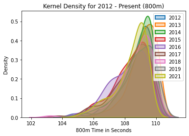
The kernel density for the 800m, years 2012-2021.
| Rank | 2012 | 2013 | 2014 | 2015 | 2016 | 2017 | 2018 | 2019 | 2021 | |
|---|---|---|---|---|---|---|---|---|---|---|
| count | 100.000000 | 100.000000 | 100.000000 | 100.00000 | 100.000000 | 100.000000 | 100.000000 | 100.000000 | 100.000000 | 100.000000 |
| mean | 50.500000 | 108.741600 | 109.148700 | 108.85960 | 108.378000 | 108.189200 | 108.419100 | 108.629700 | 108.754000 | 108.403100 |
| std | 29.011492 | 1.044447 | 0.850278 | 0.96219 | 1.061886 | 1.155218 | 1.211719 | 1.154088 | 1.128423 | 1.019719 |
| min | 1.000000 | 104.750000 | 106.200000 | 105.35000 | 105.580000 | 104.630000 | 103.730000 | 103.250000 | 104.760000 | 105.160000 |
| 25% | 25.750000 | 108.240000 | 108.670000 | 108.47750 | 107.717500 | 107.335000 | 107.765000 | 108.040000 | 108.275000 | 107.927500 |
| 50% | 50.500000 | 109.030000 | 109.290000 | 109.19500 | 108.545000 | 108.500000 | 108.745000 | 108.990000 | 108.925000 | 108.755000 |
| 75% | 75.250000 | 109.495000 | 109.810000 | 109.56500 | 109.252500 | 109.142500 | 109.302500 | 109.452500 | 109.610000 | 109.190000 |
| max | 100.000000 | 109.890000 | 110.210000 | 109.90000 | 109.730000 | 109.690000 | 109.830000 | 109.870000 | 110.060000 | 109.530000 |
800m Analysis
2020 is not included because of the pandemic year. As results continue to be run and we head into the post season, let’s take note. While the average of this year is not an outlier compared to years past, the depth of the percentiles shows a shift down, to a concentration of faster times. Right now, this year’s data is most comparable to 2016.
1500m Kernel Density
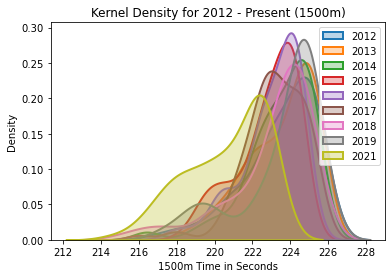
The kernel density for the 1500m, years 2012-2021.
| Rank | 2012 | 2013 | 2014 | 2015 | 2016 | 2017 | 2018 | 2019 | 2021 | |
|---|---|---|---|---|---|---|---|---|---|---|
| count | 100.000000 | 100.000000 | 100.000000 | 100.000000 | 100.000000 | 100.000000 | 100.000000 | 100.000000 | 100.000000 | 100.000000 |
| mean | 50.500000 | 223.449200 | 223.508700 | 223.412600 | 222.748600 | 222.981800 | 223.132800 | 222.998600 | 223.486600 | 220.620800 |
| std | 29.011492 | 1.957686 | 1.774577 | 1.811622 | 1.611957 | 1.605672 | 1.659264 | 2.259134 | 2.174883 | 2.130243 |
| min | 1.000000 | 216.770000 | 218.530000 | 216.340000 | 218.350000 | 217.740000 | 215.990000 | 215.010000 | 217.200000 | 214.680000 |
| 25% | 25.750000 | 222.592500 | 222.247500 | 222.602500 | 221.987500 | 222.275000 | 222.355000 | 222.402500 | 222.927500 | 218.990000 |
| 50% | 50.500000 | 223.970000 | 224.185000 | 223.895000 | 223.185000 | 223.470000 | 223.220000 | 223.805000 | 224.430000 | 221.165000 |
| 75% | 75.250000 | 224.980000 | 224.930000 | 224.780000 | 224.010000 | 224.220000 | 224.367500 | 224.597500 | 224.895000 | 222.430000 |
| max | 100.000000 | 225.790000 | 225.680000 | 225.330000 | 224.610000 | 224.930000 | 225.440000 | 225.220000 | 225.620000 | 223.150000 |
1500m Analysis
2020 is not included because of the pandemic year. The striking characteristics of this graph explain the summary statistics below. This distribution looks as though it has been shifted to the left. Not surprisingly, as verified by the summary statistics, the 75th, 50th, and 25th percentiles have been shifted down. The slowest time in the array for 2021 is over two seconds ahead of that of 2019.
5,000m Kernel Density
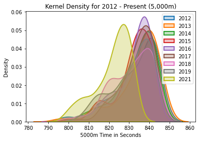
The kernel density for the 5000m, years 2012-2021.
| Rank | 2012 | 2013 | 2014 | 2015 | 2016 | 2017 | 2018 | 2019 | 2021 | |
|---|---|---|---|---|---|---|---|---|---|---|
| count | 100.000000 | 100.00000 | 100.000000 | 100.00000 | 100.000000 | 100.000000 | 100.000000 | 100.000000 | 100.000000 | 100.000000 |
| mean | 50.500000 | 833.05800 | 834.613000 | 833.60200 | 832.736000 | 832.357000 | 833.640000 | 831.041000 | 831.195000 | 821.896000 |
| std | 29.011492 | 10.80636 | 10.625248 | 9.40652 | 9.044129 | 8.876655 | 8.766822 | 10.151828 | 9.936428 | 8.773674 |
| min | 1.000000 | 798.40000 | 795.300000 | 806.90000 | 800.300000 | 804.200000 | 797.500000 | 798.700000 | 805.000000 | 799.900000 |
| 25% | 25.750000 | 828.00000 | 830.400000 | 828.90000 | 830.250000 | 828.725000 | 829.600000 | 822.850000 | 825.525000 | 816.425000 |
| 50% | 50.500000 | 836.85000 | 837.900000 | 836.00000 | 834.400000 | 834.850000 | 835.750000 | 832.650000 | 834.400000 | 824.700000 |
| 75% | 75.250000 | 841.62500 | 842.225000 | 840.47500 | 839.150000 | 838.800000 | 840.275000 | 839.750000 | 839.375000 | 828.650000 |
| max | 100.000000 | 844.30000 | 846.400000 | 845.10000 | 844.400000 | 842.400000 | 844.200000 | 843.500000 | 843.300000 | 832.100000 |
5,000m Analysis
2020 is not included because of the pandemic year. Once again, we see what looks like a kernel density plot that had a linear transformation applied to it. The graph looks like someone physically picked it up and moved it. Compared to 2019, the 2021 75th percentile is about 5.1 seconds faster, the 50th is about 9.1, and the 25th is 9 seconds faster.
10,000m Kernel Density
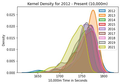
The kernel density for the 10,000m, years 2012-2021.
| Rank | 2012 | 2013 | 2014 | 2015 | 2016 | 2017 | 2018 | 2019 | 2021 | |
|---|---|---|---|---|---|---|---|---|---|---|
| count | 100.000000 | 100.000000 | 100.000000 | 100.000000 | 100.000000 | 100.000000 | 100.000000 | 100.000000 | 100.000000 | 100.000000 |
| mean | 50.500000 | 1757.587000 | 1766.814000 | 1754.033000 | 1756.877000 | 1758.971000 | 1755.463000 | 1756.511000 | 1746.805000 | 1733.517000 |
| std | 29.011492 | 28.643347 | 19.773306 | 22.069459 | 21.690103 | 17.572248 | 22.791127 | 22.929263 | 21.014883 | 21.015766 |
| min | 1.000000 | 1647.900000 | 1672.300000 | 1656.700000 | 1674.200000 | 1672.700000 | 1684.900000 | 1684.400000 | 1691.300000 | 1667.200000 |
| 25% | 25.750000 | 1749.250000 | 1760.375000 | 1744.350000 | 1745.875000 | 1749.650000 | 1740.050000 | 1748.475000 | 1735.625000 | 1722.050000 |
| 50% | 50.500000 | 1766.700000 | 1771.950000 | 1757.300000 | 1759.800000 | 1759.700000 | 1761.750000 | 1760.000000 | 1753.300000 | 1737.700000 |
| 75% | 75.250000 | 1775.775000 | 1780.275000 | 1771.575000 | 1775.625000 | 1772.800000 | 1773.800000 | 1774.075000 | 1763.325000 | 1750.675000 |
| max | 100.000000 | 1787.900000 | 1787.600000 | 1778.900000 | 1786.600000 | 1782.300000 | 1783.400000 | 1782.600000 | 1772.200000 | 1759.500000 |
10,000m Analysis
2020 is not included because of the pandemic year.
Once again, the 75th, 50th, and 25th percentiles have been shifted, by 12, 9, and 7 seconds, respectively. Check out the charts and study them for a little bit, and see if you notice anything interesting that you think I might have missed.
Final Remarks
I’ve been analyzing this data since April and it’s been a joy to run the kernel density plots each week. It’s always a joyous feeling to make predictions and see them come to life in real world scenarios.
I was talking the ear off of my family members since the first indoor races of the season, telling them that I thought that the spikes would blow open track and field times. According to the data, we are witnessing a new era in track and field.
While I still give much credit to the athletes for working extremely hard during quarantine, Nike has also done an amazing job with innovation.
The addition of ZoomX foam to spikes has been transformational, and I think the outdoor seasons in years to come should be quite thrilling. I feel quite confident in saying that I think a world record is possible in the 1500m this year.
I figured that the new spikes would cause a linear transformation to the dataset densities, and that has been corroborated by each and every plot. It’s truly astounding.
If you found something in this project interesting, have a criticism/ suggestion on what I can improve, or would like to collaborate on a project, feel free to shoot me an email, colinfitzgerald@berkeley.edu.
Have a great day. I hope you enjoyed reading this, and thank you for your time.